News and Insights
Design 101: Three Basic Layouts
February 9, 2015
While lately the word ‘basic’ has become a bit synonymous with venti Starbucks pumpkin spice lattes, leggings and saying things like, “ILY bae,” when it comes to user experience and website design there are three basic layouts that form the foundation for much of what you see in print and online.
#1: The Standard
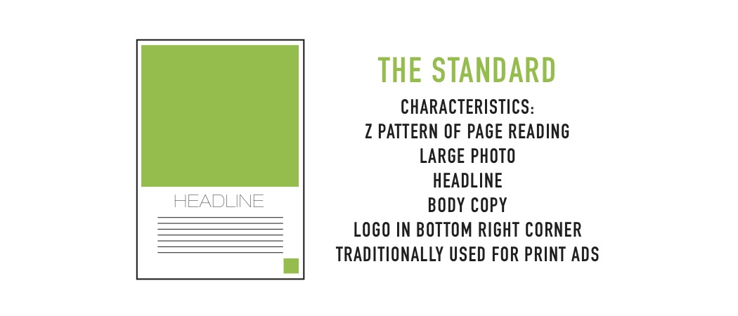
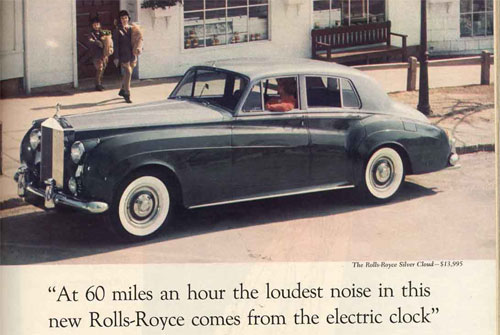
This essential design was first made famous by David Ogilvy in his 1959 Rolls-Royce ad with the brilliant headline, “At 60 miles an hour, the loudest noise in this new Rolls-Royce comes from the electric clock.” It featured a dominant photo of the vehicle that took up almost half of the page and was accompanied by 13 benefits of the car.
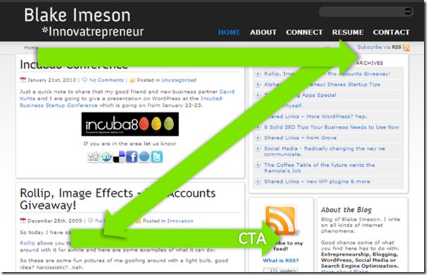
Since this advertisement’s debut, it was discovered that people tend to skim ads in a ‘Z’ pattern, with particular focus on the image and the bottom right corner. Starting in the top left corner and working its way to the bottom right in a ‘Z’, the eye scans the page for its content. That’s why since this design’s first major appearance, logos and calls to action have been added to the bottom right corner and body copy has become almost non-existent to make way for larger images.
While this layout made its debut in print, it has also become quite popular for web design, with many companies using it for their own home pages, including us! Large images taking up the bulk of the opening screen with essentials like menu buttons and social links in the top and bottom corners with copy in between, works perfectly for businesses that want to add a visual personality to their brand without compromising essential written information.
#2: The Ruler
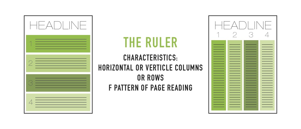
The second essential design format everyone (especially budding designers) should know is “The Ruler.” The main jist is that the layout organises the content into columns and rows. In print it is traditionally seen with ‘Best Of’ lists or reviews of movies, books and the like. It is the optimal layout for displaying the most content on one page.
However, it has adapted itself to web design thanks to the ‘F’ pattern of page reading. Thank to the same eye tracking technology that discovered the ‘Z’ pattern of scanning, scientists realised that with websites, people tend to focus more on the left-hand side of the screen, occasionally scanning across the page. This is particularly relevant to row-based designs and can be seen on multiple blogs and newspaper websites.
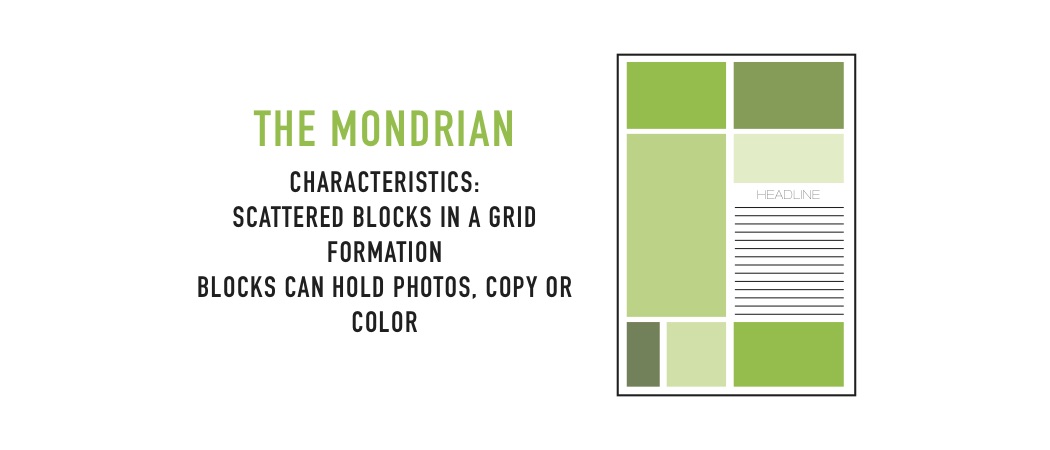
#3: The Mondrian
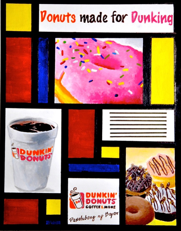
The final essential design layout is the Mondrian. Just like the artist, the Mondrian layout utilises blocks of content of various sizes. Instead of being filled with solely colours, these blocks can be filled with words and colours. It’s a bit more open in terms of display, and it works for a variety of story types. It’s a perfect if you’re having difficulty choosing just one photo to use or if you want to mix a variety of photos with one or two brilliant quotes.
In terms of web design the Mondrian is slowly becoming more used, as certain homepages and websites, like Slate and AdvertisingAge. It’s also making huge appearances with cross-platform design, seen with the Windows operating system’s modular design. Due to its use of blocks, the Mondrian style is perfect for cross-platform and responsive design. We’ll delve into that in greater detail in a later article, so keep reading our blog to find out more on design.
Contact Us
Do you have a project and need a web design agency? Our team have help hundreds of different companies elevate their brands through effective design. Get in touch, we’d love to find out how we can help.
-
TAGS:
- Technology
