OUR WORK DEPOP
Building a community platform for Depop to power deeper connections
Depop is a global fashion resale marketplace, allowing members to buy and sell their previously-loved fashions and vintage styles. FINN Partners were asked to create a new website for a global competition to find the best of the best in the online community.
A bespoke design for a descerning and lucrative young audience.
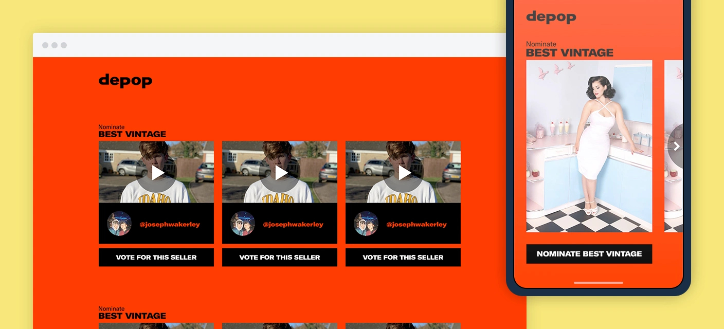
Depop wanted to pay back to and reward their community by holding a series of awards in various categories. They needed a bespoke website to engage their target audience to participate in their awards process and vote.
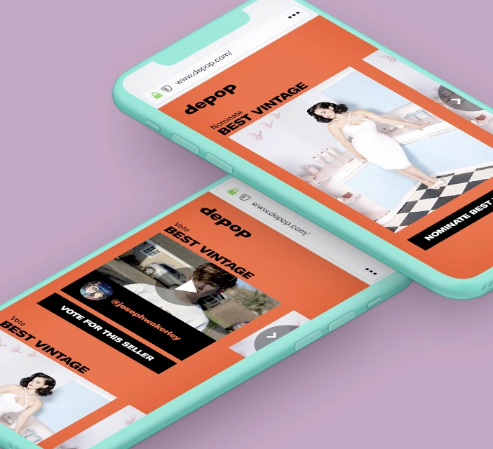
They dubbed the awards Depop Disruptors and tasked FINN Partners with conceptualizing, designing the website and developing the website system from scratch. We knew that more than 90% of visitors to the site would be on a mobile device, so we ensured the site was fully designed and developed with a mobile-first approach, seamlessly integrating with Depop’s already-established app experience.


Leveraging a loved brand to build a product that feels like a native part of it.
Design and build a brand new website and voting system
Engage with the target audience to encourage them to get involved with the process
Plug into Depop’s membership system to allow seamless voting
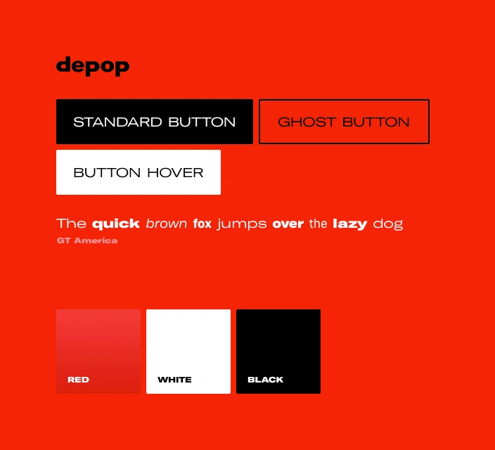
Members know and love the Depop brand, so we needed to ensure the site adheres to it

Rapid iteration and constant collaboration was the key to success.
FINN Partners’s creative and production teams met regularly with the team at Depop to ensure we kept the visual language on point and on brand.
We worked to a tight deadline to design and build the website, embracing rapid iteration on both the creative and technology side of the project. This allowed us to try many things until we honed in on something that worked incredibly well and looked fantastic, all within the confines of the Depop brand.
“Thanks guys – all looks great on the site, the team are super happy!”
Mitchell Maynard
Senior Community Development Manager
A strict, phased approach to the product development kept us on track.
The Depop Disruptors site needed to feel and look like an extension of the primary way members interact with the brand, which is via the Depop app.
We eschewed the creative planning phase of a standard project and jumped straight into rapid prototyping. This helped us not only to meet a very tight deadline, but also to try new technologies and to experiment with the creative process, all the while keeping the Depop brand and app in mind.
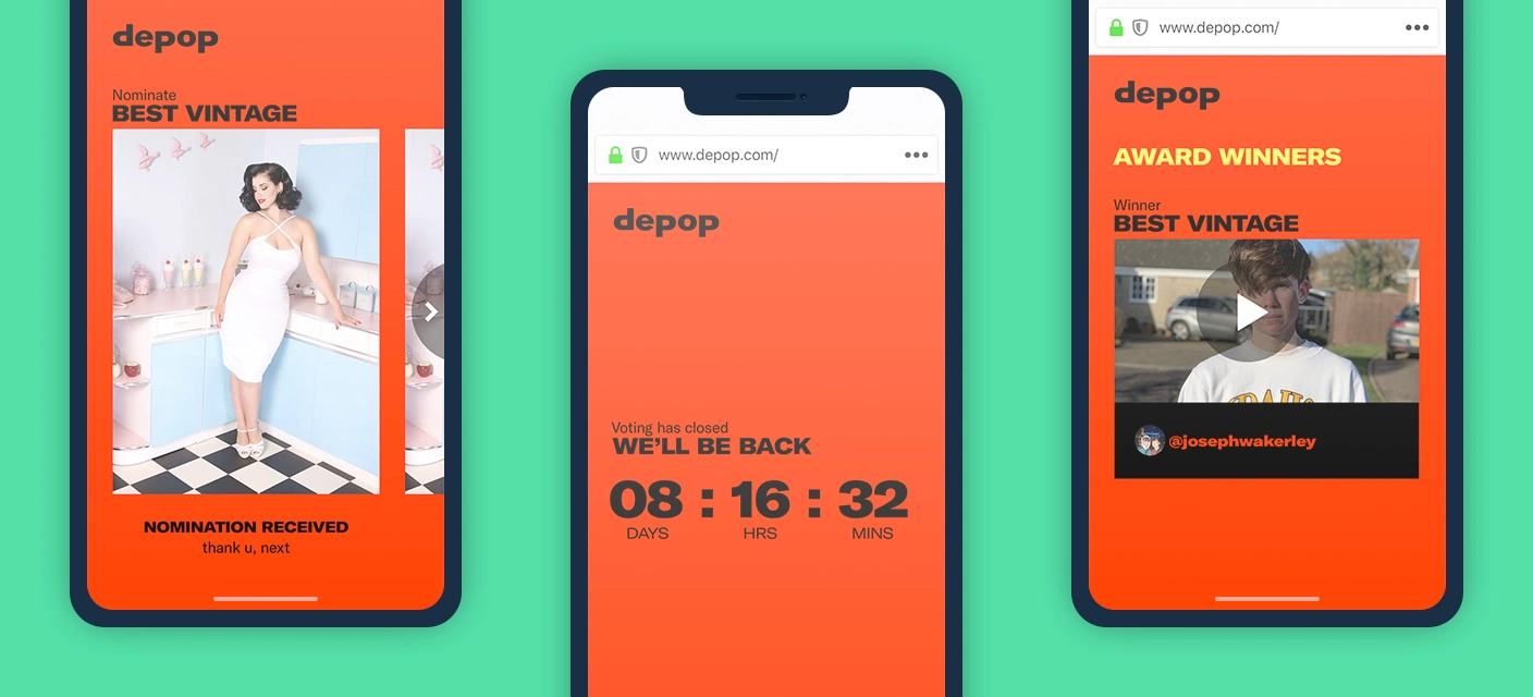
The project consisted of three key phases: pre-launch, voting and winner announcement. Each stage was carefully timed for launch to ensure it hit the various timezones at optimum points. Each stage also presented technical challenges we needed to deal with in realtime, including traffic management.

An easy-to-use final product and high engagement with Depop’s audience.
We iterated—in collaboration with the Depop team—towards the final product always with a view to achieving high engagement with Depop’s audience.
On the morning of the global launch, the site racked up a huge number of unique visitors, and almost 10,000 of those voted. The site, and the project as a whole, turned into a mega success for Depop and for us, with positive feedback from many Depop community members.
An excellent result we’re proud of
We iterated towards the final product always with a view to achieving high engagement and competition uptake with Depop’s audience.
On the morning of the global launch, the site racked up a huge number of unique visitors, and almost 10,000 of those voted. The site, and the project as a whole, turned into a mega success for Depop and for us, with positive feedback from many Depop community members.
+42,000
Active daily users
+200,000
Unique users
146
Different countries reached